
From Idea to Product
I am always on the lookout for interesting letterforms and I’ve found them in all kinds of places: handwritten manuscripts, on decorative signage, food packaging, film posters and record sleeves – and even at the fairground.
I would rather use images that I have sourced myself, because that’s how I can create something that reflects me and my personality.

One of my favourite places for looking for original source material is The British Library in London, which contains one of the world’s largest collection of books and manuscripts. Unfortunately, many of the manuscripts are too old and fragile to be handled, but thankfully there are digitised copies which makes it possible to scrutinise the quality of the writing without incurring further damage to the originals.
While I was browsing through the digitised manuscripts, looking for source material for a decorated letterforms workshop that I was teaching, I came across this letter H on page 67 of the first volume of a five-part Latin Vulgate Bible. This manuscript was written in 1430 at the Benedictine Abbey of St James in Liège, and you can see the entire manuscript by clicking on the link. LATIN VULGATE BIBLE


I purchased a digital copy of page 67 and imported the initial into the vector-based graphic application called Adobe Illustrator. Just in case you don’t know; Illustrator is a digital drawing tool that works by plotting a series of anchor points and Bezier curves to create lines and shapes and once the artwork has been created it can be re-sized — larger or smaller — without losing any detail. I favour working with this programme, rather than Procreate, because it combines precision with the tactility of calligraphy. My initial intention was to draw the letterform with the filigree and the floral diaper decoration inside the counter space, but I preferred the simplicity and modernity of the unadorned letter – and this sparked my idea to create an entire alphabet.
For this, I required some additional reference material, which I found in London’s Victoria & Albert Museum. This is the Hereford screen, which was designed by the architect Sir George Gilbert Scott in 1862 and stands at 34ft high and 36ft wide. It is predominately made from wrought and cast iron, and embellished with glass and marble mosaic panels. The figures of Christ and six angels have been electroformed in copper, and painted with red oxide paint to resemble terracotta.

But it was the lettering that I was interested in.


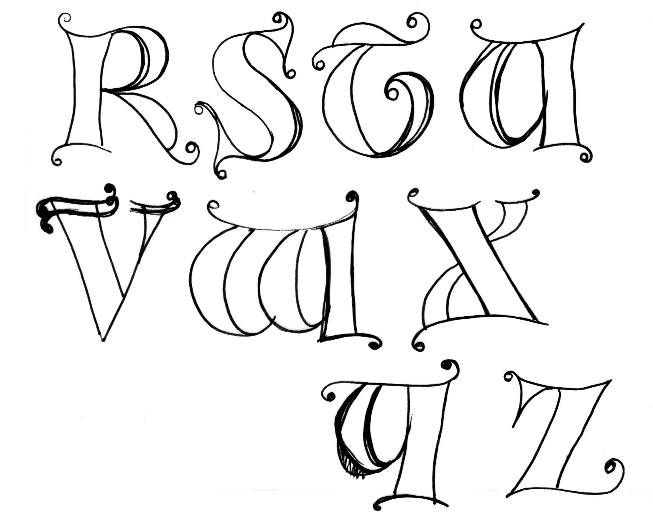
Firstly, they have a sense of exuberance: the stems of the L and I have exaggerated curves, there are various styles of extensions on each letter; some are quite angular, while others are curlier and whimsical – but because the letters have been nested within each other, they become a cohesive unit.
Below is the final alphabet and although the letter H differs from the one I saw in the Vulgate Bible they reflect some of the attributes I admired in the lettering on the Hereford Screen.

So, when you are out and about, start noticing the lettering that surrounds you and create a reference library of the things you like – because you never know where your next idea will come from.

Take a look at the full alphabet on my mugs and order your favourite letter!